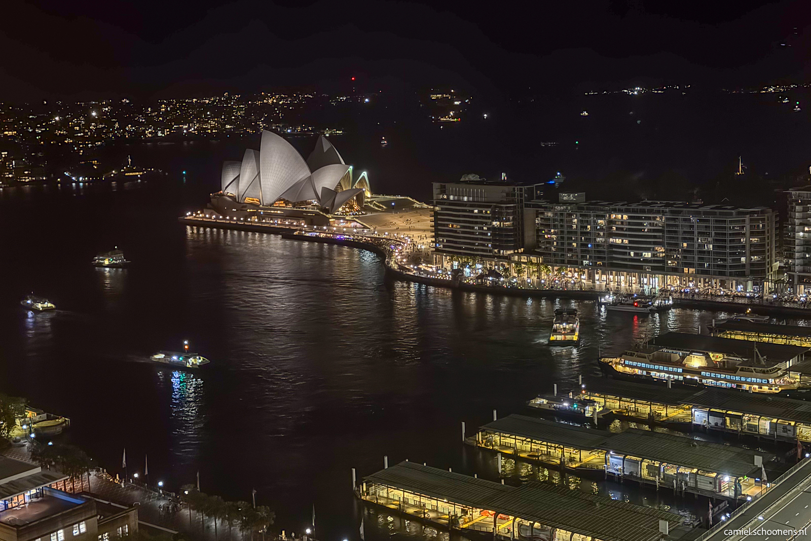
I’m back from a week of business travel to Melbourne and Sydney, Australia. I think the Sydney Opera House is one of the most magnificent buildings I’ve ever seen. I couldn’t stop looking at it; it’s so beautiful and well-designed architecturally.

Product and Technology enthusiast
I’m back from a week of business travel to Melbourne and Sydney, Australia. I think the Sydney Opera House is one of the most magnificent buildings I’ve ever seen. I couldn’t stop looking at it; it’s so beautiful and well-designed architecturally.
I’m collecting 52 songs in 52 weeks. Every Friday afternoon, I add a song to my playlist. The aim is to capture my energy and feelings for that particular Friday with the chosen song.
Week 51/52: Dance Monkey – Tones And I
After 52 weeks, I will have recorded all the seasons, holidays, and high and low weeks of the year (from October 2024 to September 2025) in one self-curated playlist on Apple Music. Don’t use Apple Music? Subscribe to weekly updates via RSS.
It’s days like these that make me super grateful for what I get to do professionally while being able to combine it with the things that give me joy in my personal life.
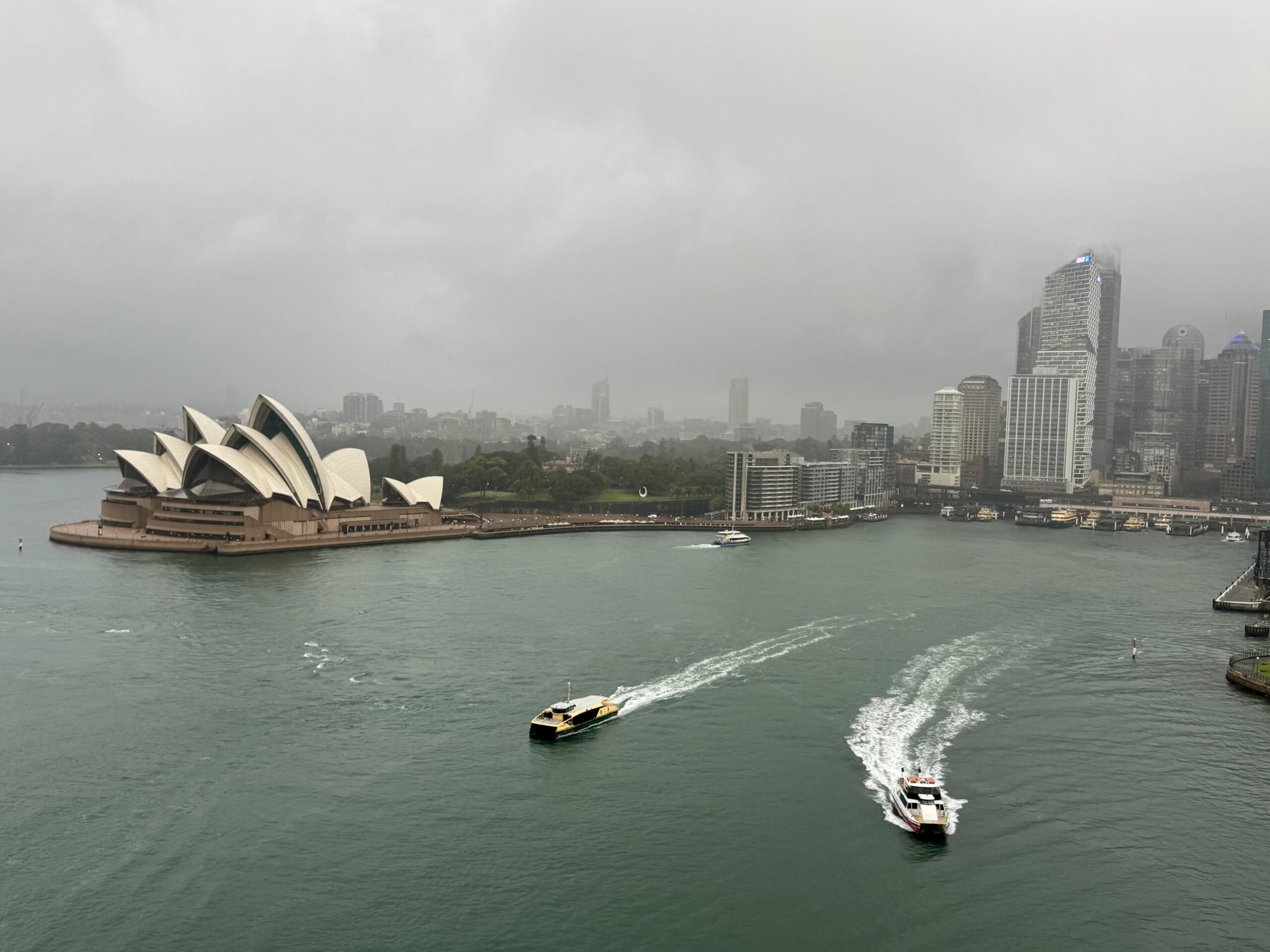
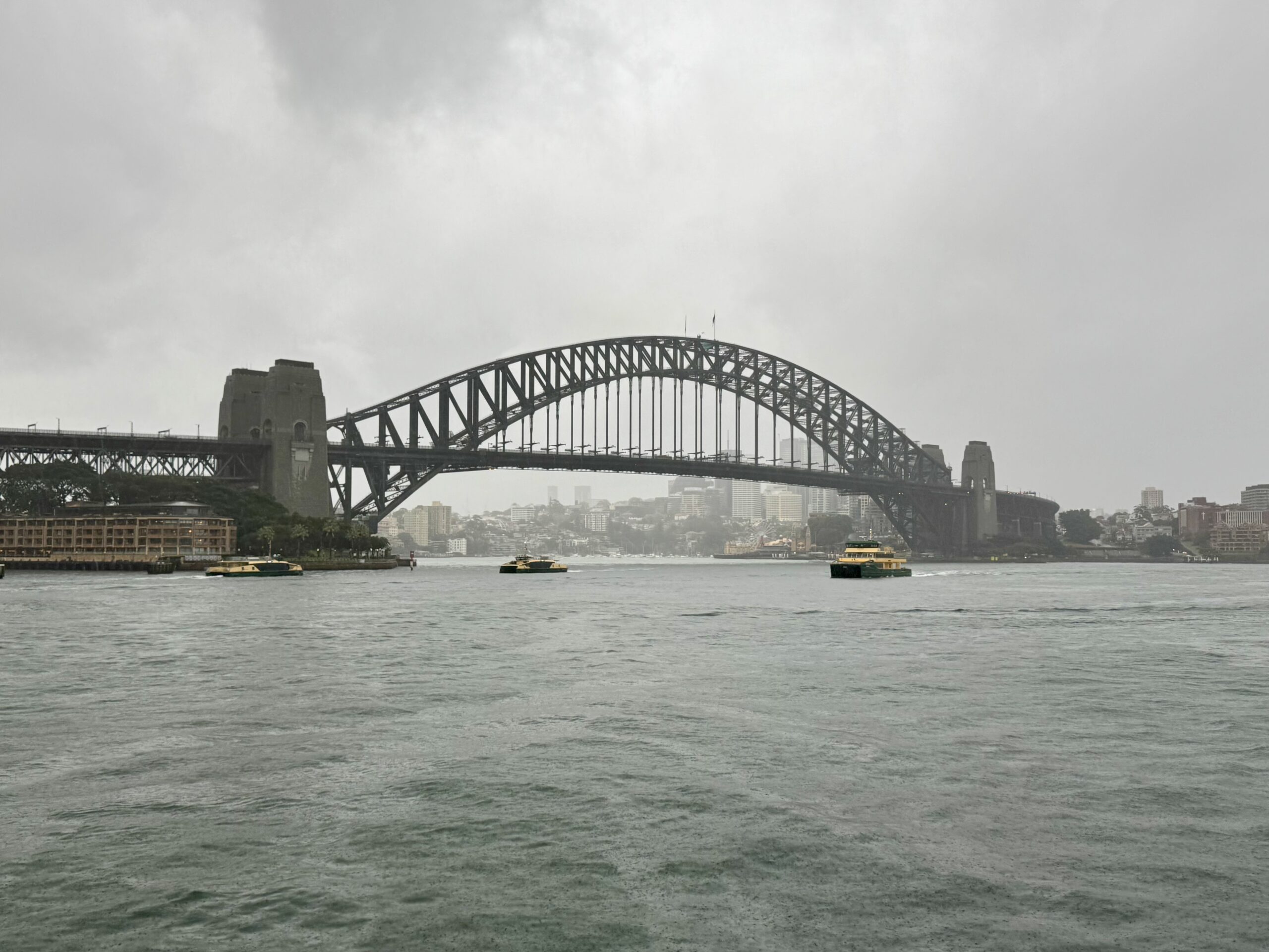
Today marks a milestone for me. I ran the iconic Sydney Harbor Bridge and around the Opera House. The weather was horrible, and I returned to the hotel soaking wet, but I didn’t want to lose this opportunity, as I don’t know if I’ll ever return to this location again.
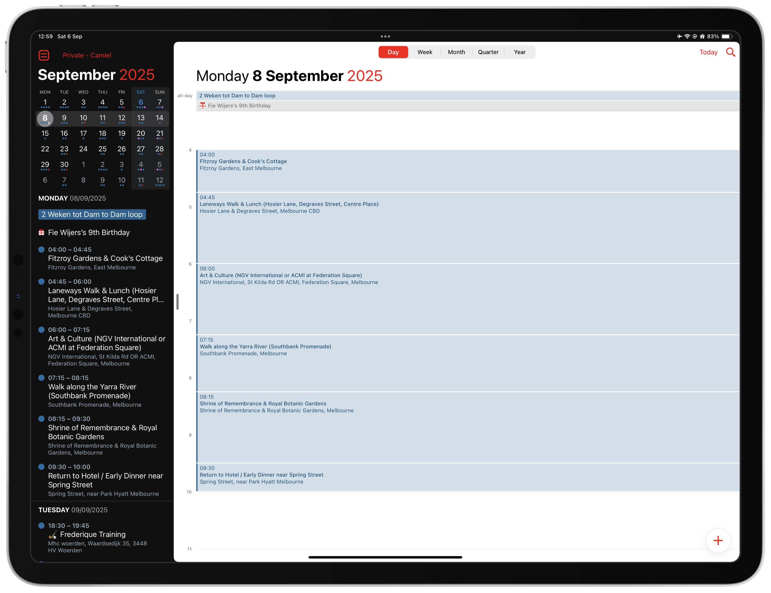
I’m on my way to Melbourne and Sydney for a week of business travel in Australia. I will have Monday afternoon off in Melbourne and Thursday afternoon and Friday morning off in Sydney. Since I’ve never been to Australia, I thought I’d ask ChatGPT for some advice on planning my afternoon visits.
While I’ve heard many people talk about creating itineraries with ChatGPT, I had never tried it myself. I find the experience magical. With a few questions and prompts, ChatGPT generated an afternoon schedule for me based on my hotel location and personal preferences. My final request was to generate an iCal file, including location information, that I could import into my calendar, which it did.
I did all of this while flying at 39,000 feet, with a super-fast, stable internet connection. Wow!
I’m collecting 52 songs in 52 weeks. Every Friday afternoon, I add a song to my playlist. The aim is to capture my energy and feelings for that particular Friday with the chosen song.
Week 50/52: More Than One Way Home – Keb’ Mo’
After 52 weeks, I will have recorded all the seasons, holidays, and high and low weeks of the year (from October 2024 to September 2025) in one self-curated playlist on Apple Music. Don’t use Apple Music? Subscribe to weekly updates via RSS.
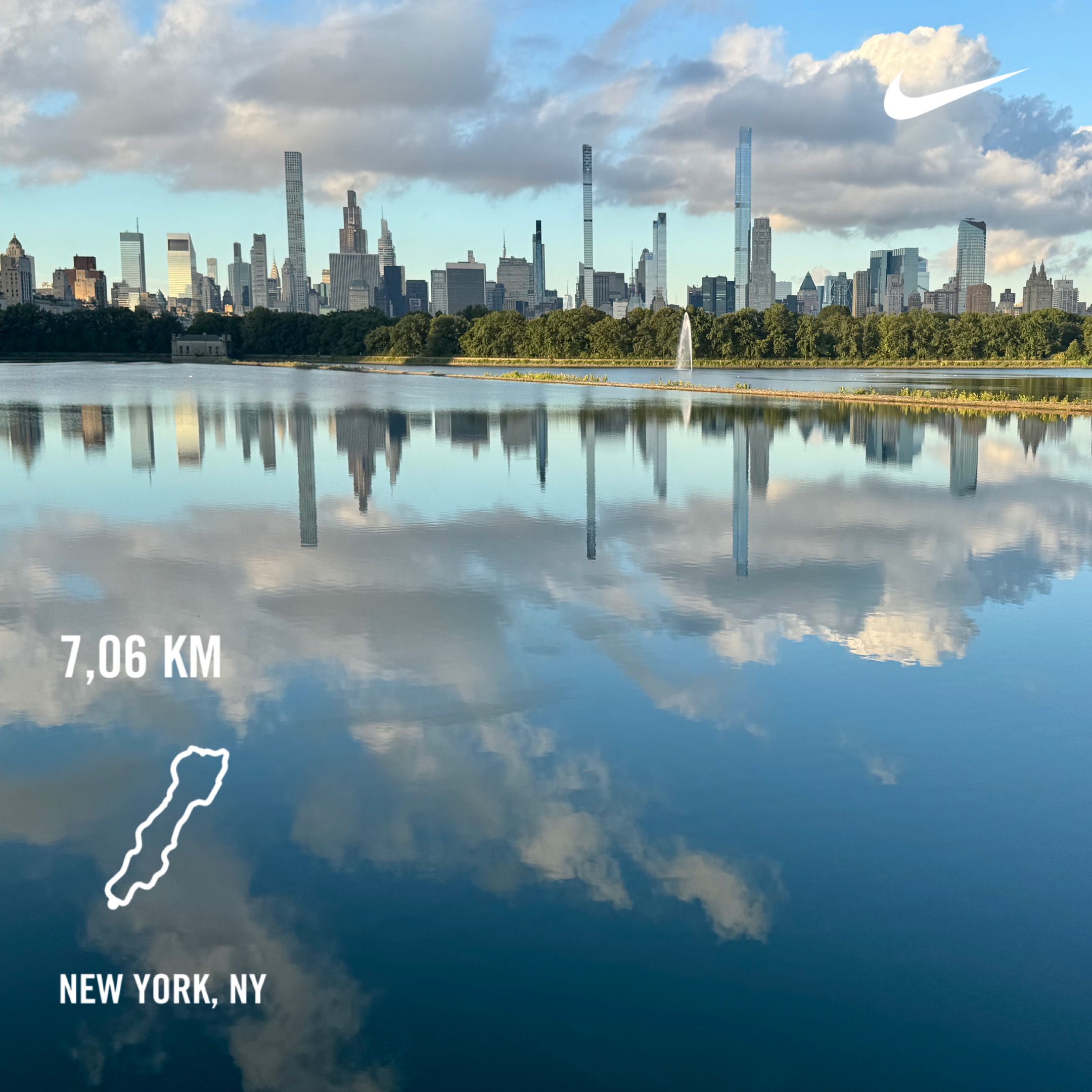
Running through Central Park, New York, was one of those things I wanted to do at least once in my life.
I can’t complain about how this recovery run went after traveling to the US from the Netherlands yesterday. I had a decent night op sleep and could cover a recovery distance of 7 kilometers in a little over 39 minutes.
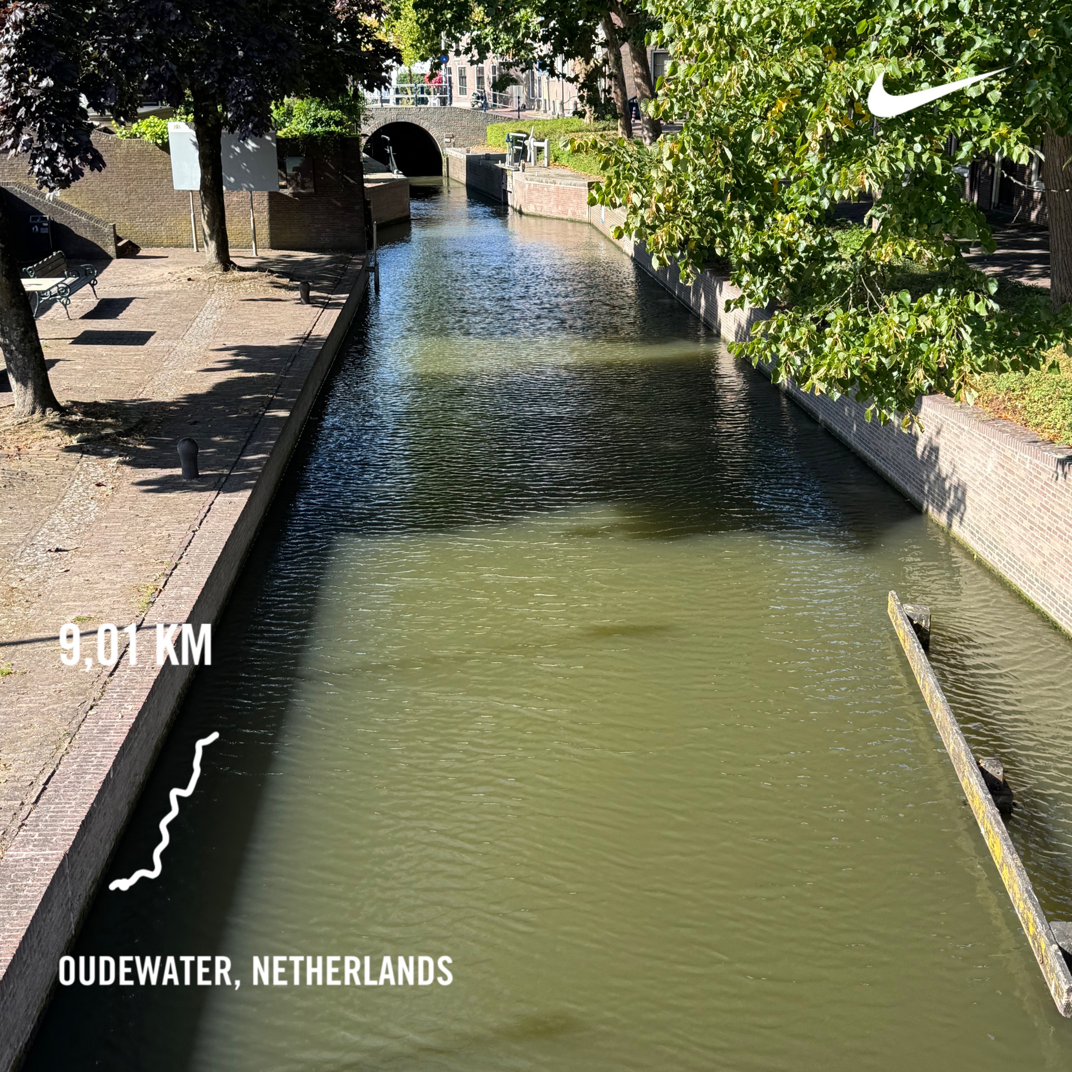
I’m not sure what happened during this long run, but it definitely didn’t go as planned. Halfway through, my legs started to feel very heavy, and my average heart rate during the run was much higher than it normally is at this pace.
I will go for an easy run tomorrow morning to see if things will be different or not.
I’m collecting 52 songs in 52 weeks. Every Friday afternoon, I add a song to my playlist. The aim is to capture my energy and feelings for that particular Friday with the chosen song.
Week 49/52: Malinteso – Ricchi & Poveri
After 52 weeks, I will have recorded all the seasons, holidays, and high and low weeks of the year (from October 2024 to September 2025) in one self-curated playlist on Apple Music. Don’t use Apple Music? Subscribe to weekly updates via RSS.
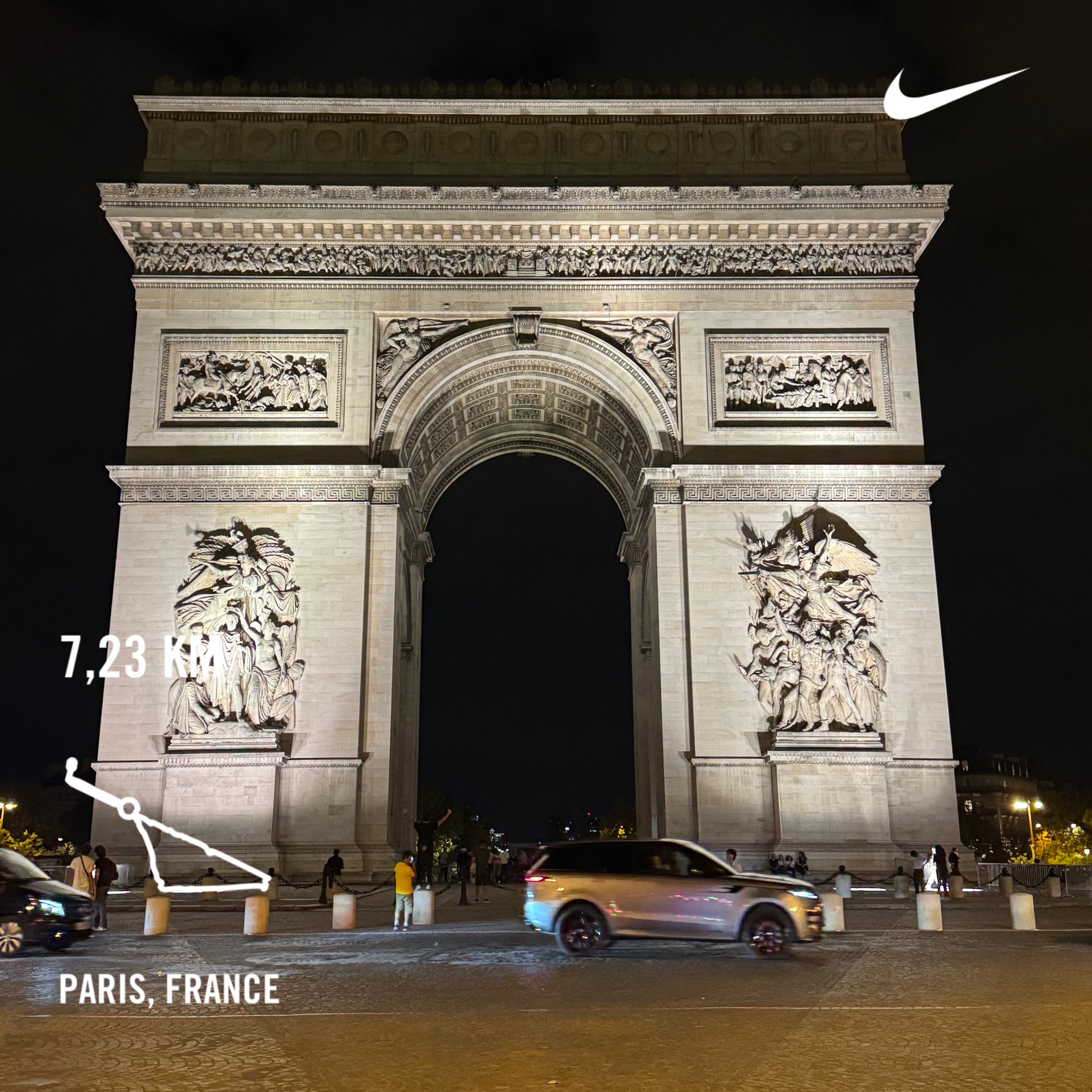
This was my early morning run with my teammate and colleague Henk-Jan through the city of Paris. We covered a little over 7 kilometers, passing some major landmarks and running along the Seine river. A run in a different area or city is always enjoyable and a great way to start the day.
I’m hoping to do the same in the next two weeks while I travel to New York, Melbourne, and Sydney for business.
I’m collecting 52 songs in 52 weeks. Every Friday afternoon, I add a song to my playlist. The aim is to capture my energy and feelings for that particular Friday with the chosen song.
Week 48/52: Let It Happen – Tame Impala
After 52 weeks, I will have recorded all the seasons, holidays, and high and low weeks of the year (from October 2024 to September 2025) in one self-curated playlist on Apple Music. Don’t use Apple Music? Subscribe to weekly updates via RSS.