• Skip to primary navigation
  • Skip to main content
  • Skip to primary sidebar

Camiel Schoonens

Energetic leader with a strong intrinsic motivation to get the best out of my work, my people and myself every day.

  • Home
  • About
  • Resume

Side Projects

Converting W to kWh in Home Assistant

17/04/2023 · 3 Comments

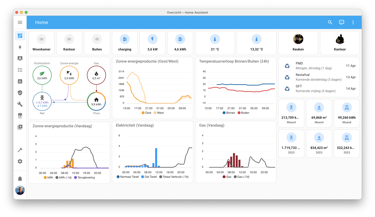
I’ve been measuring my solar panel production in Home Assistant ever since the panels were installed and I really like the insights that this has been giving me.

I’m able to capture the produced energy by using the ‘SMA Solar‘ integration as this is the vendor of my inverter. The SMA integration works quite well out of the box but has one downside: It only provides one kWh sensor that passes the total produced energy to Home Assistant. This is a useful sensor if you only want to look at the total produced energy or when you have all your panels facing in the same direction. In my case I have panels facing east and facing west. As seen below, the amount of panels is equal on both sides of the house but the production isn’t.

Converting W to kWh in Home Assistant

I figured out by looking through the provided ‘SMA Solar‘ sensors in Home Assistant that my inverter does measure the different panel groups on two different sensors (sensor.stp6_0_3av_40_341_pv_power_a and sensor.stp6_0_3av_40_341_pv_power_b). The measurement is in Watts and not in kWh.

While Watts is perfectly fine as a measurement for production insights the default Energy Dashboard in Home Assistant is only capable of showing kWh sensors (with an Energy device class). So to make the two individual solar panel groups show up in the Energy Dashboard you need to convert a Watt sensor into a kWh sensor. Once you figure out that you need the Riemann sum integral integration for this the exercise is easy.

- platform: integration
  source: sensor.stp6_0_3av_40_341_pv_power_a
  name: energy_produced_east_panels
  unit_prefix: k
  round: 2
- platform: integration  
  source: sensor.stp6_0_3av_40_341_pv_power_b
  name: energy_produced_west_panels
  unit_prefix: k
  round: 2

All you need to do is add the above code (adjusted to your personal sensor naming) in your configuration.yaml. You need one platform integration per sensor. After saving your yaml file and rebooting Home Assistant you can add the additional sensors to your Energy Dashboard. Do wait for your new sensors to have some data point collected.

HACS in a Home Assistant Docker on a Synology NAS

16/04/2023 · Leave a Comment

I used this weekend to move my Home Assistant and HACS installation from my Raspberry Pi to a Docker container on my Synology NAS. The main reason for this move is performance and resilience as I’ve read to many stories on SD Cards in a Raspberry Pi failing due to the amount of read/writes happening.

Loading the Docker container on my Synology was really easy. Getting HACS (Home Assistant Community Store) up and running again in Home Assistant was a little bit harder, while the instructions that I found to do this were crystal clear.

The reason for not being able to install HACS through the default install script is that it depends on the availability of the ‘unzip’ command. Synology uses ‘7z’ instead of ‘unzip’. This results in the HACS installation script not working out of the box.

Once you’ve figured this out the solution to this problem is fairly easy:

  1. Load the script at this location in your browser and copy the complete text.
  2. Create a new file on your NAS in the /docker/homeassistant/config/custom_components directory, call it what you want. I named the file hacs.pl
  3. Edit the file in a text editor and past the text you copied in step 1.
  4. Use your text editor to find/replace unzip with 7z (1 instance should be found)
  5. Save the file and execute (./hacs.pl) the script through a terminal (ssh) on your NAS. If you can’t execute the script you need to do a chmod 777 on hacs.pl
  6. That it, you can now continue with step 4 in this tutorial.

Home Assistant Dashboard Update

10/04/2023 · 15 Comments

During the Easter weekend I had some extra time to update my Home Assistant dashboard. Previous iterations of this dashboard can be found here and here.

The main updates / changes that I did:

  • Changed the colours used in the graphs.
  • Added a graph for my solar inverter to measure the Watt produced by the panels that I have east and west facing.
  • Removed several temperature sensors as I was never looking at them.

Home Assistant notificaties voor energieverbruik en energieproductie

20/03/2023 · Leave a Comment

Ik heb vanavond een half uurtje met Home Assistant zitten spelen om notificaties te versturen over mijn dagelijkse zonnepanelen opbrengst en de kosten van het laden van een auto aan onze laadpaal.

Ik heb nu twee automatiseringen gemaakt die de volgende notificaties versturen:

  1. Dagelijkse notificatie van mijn zonnepanelen opbrengst op het moment dat de zon onder gaat.
  2. Notificatie wanneer een auto aan de laadpaal is opgeladen, inclusief een berekening van de kosten hiervan.

Deze notificaties zijn gebaseerd op de sensoren die ik heb aangemaakt met ‘Utility Meter’. Ik heb sensoren aangemaakt voor het meten van mijn stroomverbruik en stroomopbrengst per uur, dag, week, maand etc. Deze gebruik ik voor bovenstaande pushmeldingen en voor mijn dashboard.

De sensor met de dagopbrengst van mijn zonnepanelen lees ik uit op het moment dat de zon onder gaat en vermenigvuldig deze dan met de kWh prijs die ik betaal. De combinatie van beiden verstuur ik in een bericht aan naar mijn telefoon. In yaml code ziet dat er als volgt uit:

alias: "[Push bericht] Opbrengst Zonnepanelen"
description: "Dagelijks bericht bij zonsondergang met de opbrengst van mijn zonnepanelen."
trigger:
  - platform: sun
    event: sunset
    offset: 0
condition: []
action:
  - service: notify.mobile_app_iphone_13_pro_max_camiel
    data:
      title: Zonnepanelen opbrengst
      message: >-
        Vandaag is er {{ states("sensor.daily_energy_production") }} kWh (€ {{
        (states('sensor.daily_energy_production') | float * 0.21343 ) | round(2)
        }}) energie opgewekt.
mode: single

Christmas Side Project – My Home Assistant Dashboard

12/01/2023 · Leave a Comment

I’ve been using Home Assistant since early 2020 after having heard about it in a technology podcast that I listen to regularly. Until now my usage was mainly around automations that I couldn’t achieve with the ‘Apple Home’ app and some basic energy monitoring with the default feature set that Home Assistant has available for this.

I used my Christmas holiday period of this year to start a little side project on Home Assistant dashboarding with the main use case of creating some custom energy graphs as I’m getting solar panels installed in the second half on January. The result of this effort is captured in the screenshot below.

My Home Assistant Dashboard

What’s on the dashboard

Column 1: Todays temperature and energy consumption

  • The first column on the left is all about temperature in and outside the house and my daily energy usage compared to the day before. I’m using the custom ‘ApexCharts Card‘ for this.
  • I’m showing the days temperature across three locations in the house and one outside the house in a line chart on the top left. The line chart only shows data from the current day starting at midnight. The data is populated from the different sensors providing the data. I chose to leave out the chart header showing the current temperature for each of the sensors, mainly to save space.
  • The next two charts, also ApexCharts Cards, are about todays energy and gas consumption compared to the day before. The data is collected with the ‘Utility Meter Intergration‘ which I used to create hourly, daily, weekly, monthly and yearly resetting sensors. Both graphs use the hourly sensors giving me the option to show bar charts on my consumption grouped by the hour.
  • Both energy consumption charts also show the data from yesterday. At some point in the future I will change this offset to -7 days as I believe it makes more sense to compare to the same day in the past then to the previous day.
  • I have two rates for electricity in my contract (low and high) and because of that the usage is measured on two different sensors. I created a custom sensor that sums both sensors together and then the ‘Utility Meter Integration’ again to create hourly, daily, etc. slices of that data to be shown in future graphs.
  • Once I have my solar panels installed later this month I will also add a ‘net usage’ sensor to the graph.

Column 2: Light switches, historical temperature trends and bandwidth data

  • The first row is beholding my light cards. These cards trigger three different light groups that I have created. One for the living room lights, one for my home office lights and one for the garden lights around the house. These cards are mainly there to interact on an ad hoc basis or to have a quick view on the current states. The lights in my house a generally activated by an automation schedule or a motion switch in the house.
  • The second row of cards is similar to the light switches but then for my Sonos speakers in the house, one in the kitchen and one in my home office.
  • I use the custom ‘Mini Graph Card‘ to show 7 day minimum and maximum temperature data in a ‘smoothened’ graph. This cards is more about trend then about the actual readings. This is also the reason on why I’m showing the minimum and maximum datapoints in the header.
  • Directly below the 7 day temperature trend I’m showing the current outside humidity and air pressure in two separate cards.
  • The network bandwidth monitor uses the sensors created by the ‘Speedtest Integration‘. I measure available network bandwidth towards the internet once every hour. The data is shown using the ‘Mini Graph Card’ card, similar to the setup used for the 7 day energy graph.
  • The last two cards in this column show the actual inkt levels in printer.

Column 3: Car charging, wast collection, long term energy usage and AdGuard data

  • The top 3 cards are showing data around the charging of my car. The top level card shows the current charging status (Disconnected, Connected, Charging, Completed) and the two sensors below show the current speed of charging and data on the last charge of the car.
  • Right underneath the charging data is a custom card ‘Entity-Row‘ together with ‘Auto-Entities‘ to display wast collection dates in order of collection date. The data is here for reference only. I mainly use automations to send mobile reminders and a to-do item to my task manager app.
  • The cards below the waste collection show daily and yearly numbers on my energy consumption. The data is coming from the daily and yearly ‘Utility Meter Integration’ sensors that I mentioned earlier. I still need round the numbers of the sensors as the data behind the comma is somewhat irrelevant.
  • The final chart in this column is showing the amount of ads that I’m blocking on network level versus the overall amount of queries done by all the devices on my network. The data is coming from AdGuard and I chose to show a seven day trend, similar to the graph on the outside temperature trend.

Use of colour

My dashboard cards use a custom colour pallet that I generated with the online tool ‘Coolors’. I’ve chosen to generate a pallet where the three main colours are variants of blue supported by two types of red. One red for displaying historical data and one lighter red to differentiate outside and inside temperatures in the graph in the top left corner.

I’ve tried to be as consistent as possible in the use of colours across all cards and data points that I show. Unfortunately this isn’t always possible due to design choices for some of the cards that I use. Per example the cards used for switching my light groups (top center) are using tones of yellow representing the active colour of the lightbulb.

Primary Sidebar

Recent Posts

  • San Francisco Bay Area • Ludwig Favre
  • Minimal Saltern Study Wallpapers — Basic Apple Guy
  • The Secret to Leading Organizational Change Is Empathy
  • Smart Home Dashboard with Home Assistant and Inkplate – IT-obey!
  • Converting W to kWh in Home Assistant

Recent Comments

  1. Jesse D on Home Assistant Dashboard Update
  2. MichaelTheDane on Home Assistant Dashboard Update
  3. Phil on Home Assistant Dashboard Update
  4. Gavin Campbell on Home Assistant Dashboard Update
  5. noxi@graz.social on Home Assistant Dashboard Update
Motivation is what gets you started. Habit is what keeps you going.
  • Email
  • LinkedIn
  • RSS

Camiel Schoonens

Copyright © 2023 · Monochrome Pro on Genesis Framework · WordPress · Log in