• Spring naar de hoofdnavigatie
  • Door naar de hoofd inhoud

Camiel Schoonens

Energetic leader with a strong intrinsic motivation to get the best out of my work, my people and myself every day.

  • Home
  • Blog
  • Linked
  • Photoblog
  • About
  • Resume

Camiel

Minimal Saltern Study Wallpapers — Basic Apple Guy 🔖

26/01/2023 · Reageer

Minimal Saltern Study Wallpapers 🔖

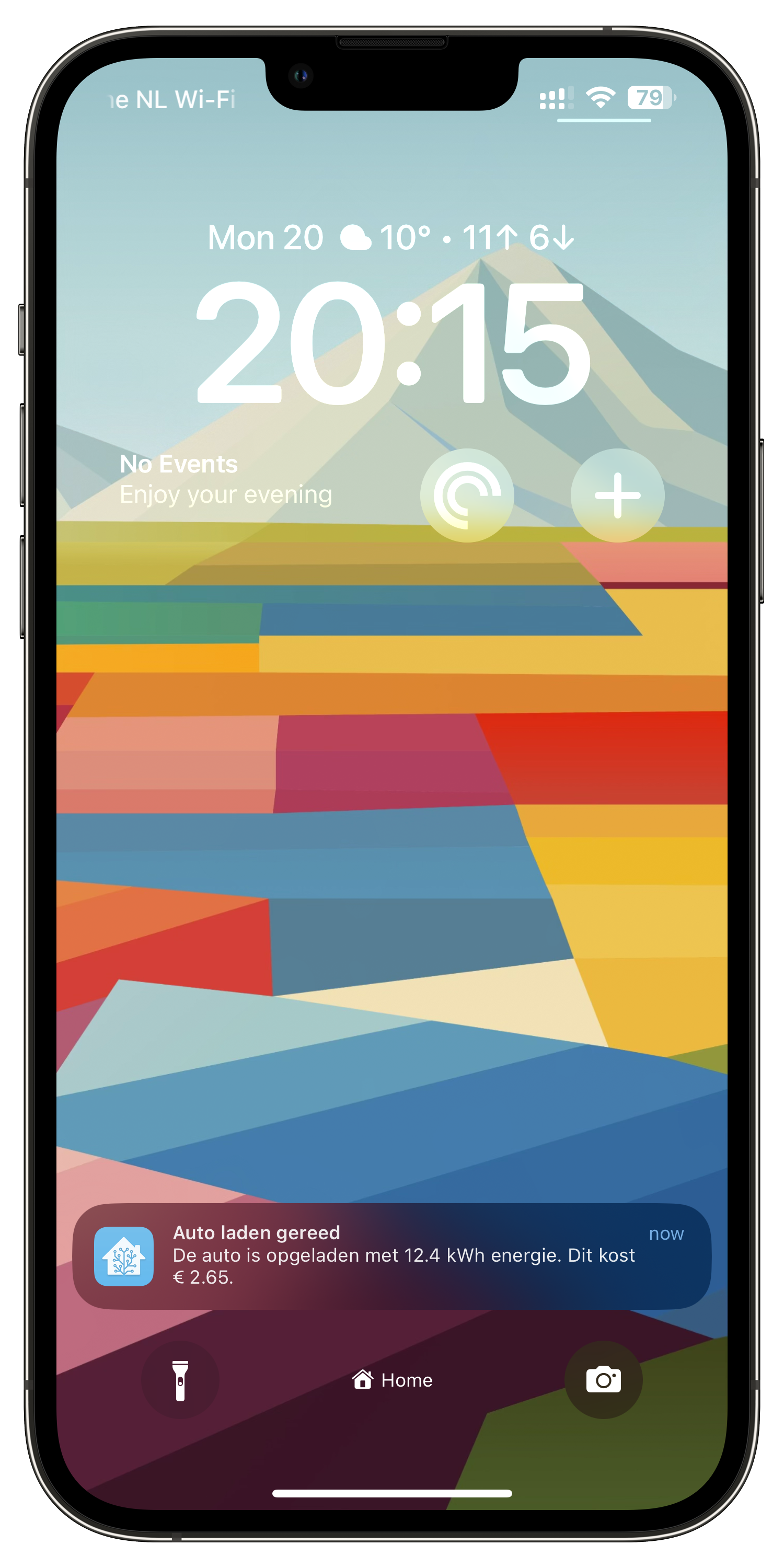
Today I am introducing three new wallpapers; a minimalist, cubist wallpaper collection for your iPhone, Mac, and iPad inspired by the Saltern Study collection. Enjoy.

Een set prachtige wallpapers als je het mij vraagt. Inmiddels heb ik deze als achtergrond op al mijn Apple devices.

San Francisco Bay Area 🔖

14/01/2023 · Reageer

San Francisco Bay Area • Ludwig Favre 🔖

Prachtige serie foto’s die ik ontdekte via Kekness. De foto’s zijn genomen in en rondom San Francisco door een fotograaf die ik nog niet kende: Ludwig Favre. Zeer de moeite waard om even te bekijken.

Christmas Side Project – My Home Assistant Dashboard

12/01/2023 · Reageer

I’ve been using Home Assistant since early 2020 after having heard about it in a technology podcast that I listen to regularly. Until now my usage was mainly around automations that I couldn’t achieve with the ‘Apple Home’ app and some basic energy monitoring with the default feature set that Home Assistant has available for this.

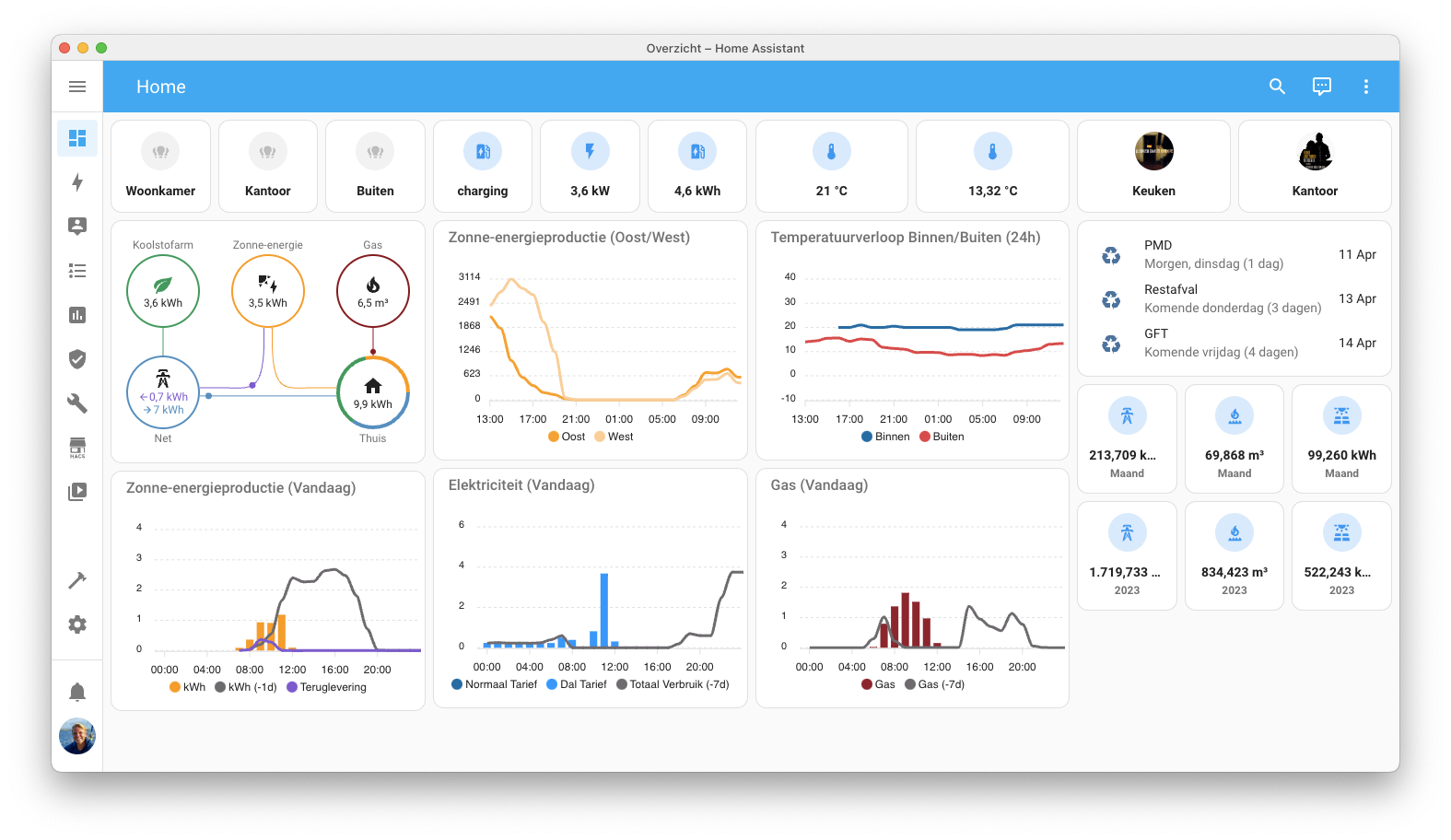
I used my Christmas holiday period of this year to start a little side project on Home Assistant dashboarding with the main use case of creating some custom energy graphs as I’m getting solar panels installed in the second half on January. The result of this effort is captured in the screenshot below.

My Home Assistant Dashboard

What’s on the dashboard

Column 1: Todays temperature and energy consumption

  • The first column on the left is all about temperature in and outside the house and my daily energy usage compared to the day before. I’m using the custom ‘ApexCharts Card‘ for this.
  • I’m showing the days temperature across three locations in the house and one outside the house in a line chart on the top left. The line chart only shows data from the current day starting at midnight. The data is populated from the different sensors providing the data. I chose to leave out the chart header showing the current temperature for each of the sensors, mainly to save space.
  • The next two charts, also ApexCharts Cards, are about todays energy and gas consumption compared to the day before. The data is collected with the ‘Utility Meter Intergration‘ which I used to create hourly, daily, weekly, monthly and yearly resetting sensors. Both graphs use the hourly sensors giving me the option to show bar charts on my consumption grouped by the hour.
  • Both energy consumption charts also show the data from yesterday. At some point in the future I will change this offset to -7 days as I believe it makes more sense to compare to the same day in the past then to the previous day.
  • I have two rates for electricity in my contract (low and high) and because of that the usage is measured on two different sensors. I created a custom sensor that sums both sensors together and then the ‘Utility Meter Integration’ again to create hourly, daily, etc. slices of that data to be shown in future graphs.
  • Once I have my solar panels installed later this month I will also add a ‘net usage’ sensor to the graph.

Column 2: Light switches, historical temperature trends and bandwidth data

  • The first row is beholding my light cards. These cards trigger three different light groups that I have created. One for the living room lights, one for my home office lights and one for the garden lights around the house. These cards are mainly there to interact on an ad hoc basis or to have a quick view on the current states. The lights in my house a generally activated by an automation schedule or a motion switch in the house.
  • The second row of cards is similar to the light switches but then for my Sonos speakers in the house, one in the kitchen and one in my home office.
  • I use the custom ‘Mini Graph Card‘ to show 7 day minimum and maximum temperature data in a ‘smoothened’ graph. This cards is more about trend then about the actual readings. This is also the reason on why I’m showing the minimum and maximum datapoints in the header.
  • Directly below the 7 day temperature trend I’m showing the current outside humidity and air pressure in two separate cards.
  • The network bandwidth monitor uses the sensors created by the ‘Speedtest Integration‘. I measure available network bandwidth towards the internet once every hour. The data is shown using the ‘Mini Graph Card’ card, similar to the setup used for the 7 day energy graph.
  • The last two cards in this column show the actual inkt levels in printer.

Column 3: Car charging, wast collection, long term energy usage and AdGuard data

  • The top 3 cards are showing data around the charging of my car. The top level card shows the current charging status (Disconnected, Connected, Charging, Completed) and the two sensors below show the current speed of charging and data on the last charge of the car.
  • Right underneath the charging data is a custom card ‘Entity-Row‘ together with ‘Auto-Entities‘ to display wast collection dates in order of collection date. The data is here for reference only. I mainly use automations to send mobile reminders and a to-do item to my task manager app.
  • The cards below the waste collection show daily and yearly numbers on my energy consumption. The data is coming from the daily and yearly ‘Utility Meter Integration’ sensors that I mentioned earlier. I still need round the numbers of the sensors as the data behind the comma is somewhat irrelevant.
  • The final chart in this column is showing the amount of ads that I’m blocking on network level versus the overall amount of queries done by all the devices on my network. The data is coming from AdGuard and I chose to show a seven day trend, similar to the graph on the outside temperature trend.

Use of colour

My dashboard cards use a custom colour pallet that I generated with the online tool ‘Coolors’. I’ve chosen to generate a pallet where the three main colours are variants of blue supported by two types of red. One red for displaying historical data and one lighter red to differentiate outside and inside temperatures in the graph in the top left corner.

I’ve tried to be as consistent as possible in the use of colours across all cards and data points that I show. Unfortunately this isn’t always possible due to design choices for some of the cards that I use. Per example the cards used for switching my light groups (top center) are using tones of yellow representing the active colour of the lightbulb.

Mastodon

30/12/2022 · Reageer

Ik heb sinds 2 november een account op mastodon.nl en in de twee maanden die volgde heb ik een kleine, leuke groep volgers op Mastodon gevonden. Een groot deel van deze volgers komen rechtstreeks van mijn Twitter account waardoor ik daar de afgelopen weken nauwelijks nog ben geweest. 

Mastodon als sociaal netwerk is leuk en het klopt dat de meeste mensen er echt veel vriendelijker zijn dan op Twitter. Dat is fijn en maakt het de moeite waard om voor terug te komen.

Mijn Twitter netwerk bestond vooral uit journalisten die schrijven over mijn interesses: technologie, leiderschap, muziek, fotografie, Apple en Formule 1. Twitter was vooral mijn ‘proxy’ naar het internet en dat is Mastodon helaas nog niet. Simpelweg omdat nog niet iedereen die ik op Twitter volgde al op Mastodon zit.

Ik gebruik regelmatig deze twee handige tooltjes om interessante volgers op Mastodon te vinden. Doe er je voordeel mee als je ze nog niet kent.

  • De website www.movetodon.org waarmee je je huidige Twitter volgers op het Mastodon netwerk kan vinden en eenvoudig opnieuw kunt volgen.
  • De website followgraph.vercel.app waarmee je interessante volgers onder je volgers ontdekt. Dit werkt op basis van het principe: Welke mensen volgen de mensen die ik volg op Mastodon het meest.

Finished reading: Beta voor alfa’s by Diederik Jekel 📚

27/12/2022 · Reageer

Leuk en eenvoudig boekje om te lezen, gaat mij vooral helpen om Natuurkunde aan mijn zoon uit te leggen.

  • « Ga naar Vorige pagina
  • Ga naar pagina 1
  • Ga naar pagina 2
  • Ga naar pagina 3
  • Ga naar pagina 4
  • Ga naar pagina 5
  • Ga naar Volgende pagina »
Motivation is what gets you started. Habit is what keeps you going.
  • E-mail
  • LinkedIn
  • RSS
  • Twitter
  • WhatsApp

Camiel Schoonens

Copyright © 2023 · Monochrome Pro on Genesis Framework · WordPress · Log in